BLACKBEARD'S
BRANDING / UI+UX / MOBILE APP
A classic sit-it restaurant that offers an a' la carte seafood and steaks menu. It seeks to expand its services and offer deliveries and pick-up orders through a simple and intuitive platform.
Concept Design & Project Proposal, Apr. '21 - Jun. '21
______________________________________________________________________
METHODOLOGY
▪️ Design Thinking was utilized because of its effectiveness and the ample time I had to complete the project.
Timeline
▪️ 4 weeks (78 hours)
My role
▪️ Sole Designer - User Research, Ideating, Wireframing, Prototyping, Usability Testing
Here, the project is summarised in four succinct parts. To view complete project, click button below.
______________________________________________________________________
1. USER RESEARCH
Research summary
▪ I conducted interviews and created empathy maps to understand the users I’m designing for and their needs.
▪ The primary user group identified through research was middle-aged and old-aged adults.
▪ This user group represents the typical Blackbeard’s customers, who are accustomed to the locally sourced seafood.
User Persona
User Journey Map
▪ Using Helena, the second persona, to map a user journey, revealed how helpful it would be for users to have access to a dedicated Blackbeard’s App for placing orders and requesting deliveries.
2. IDEATION
Storyboards
User Flow
Result
The ideation process resulted in a user flow that reveals and communicates an ordering process that is both simple and intuitive, naturally including happy paths throughout the flow.
3. DESIGN
STARTING THE DESIGN
Paper Wireframes
My initial idea was to make a personalized homepage with minimal detail. I drafted a couple of samples which included 3 different layouts.
I ended up settling on the Tiered layer cake layout with 3 sections. The other screens followed the same thought process but with different & varied results.
Digital Wireframes
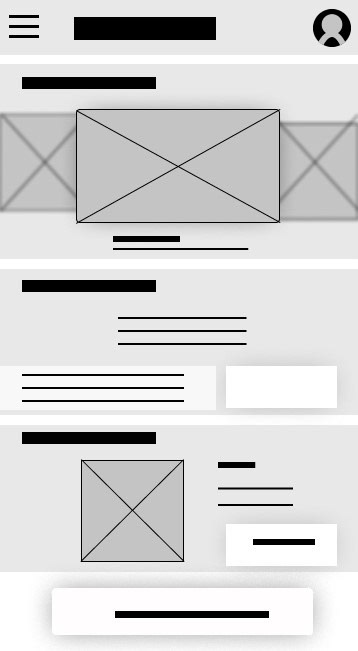
01 - Homepage
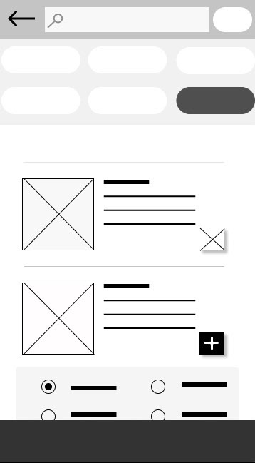
02 - Menu Screen
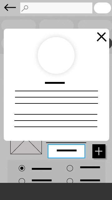
Item Info Pop-up
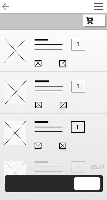
03 - Cart
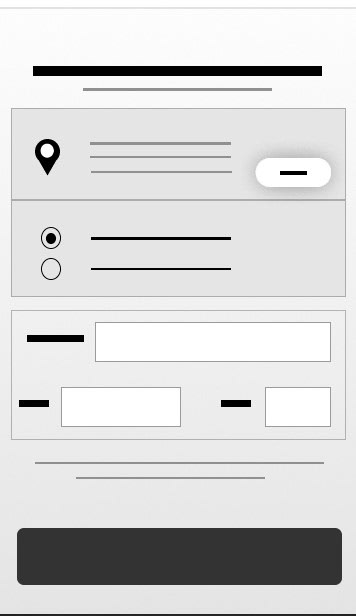
04 - Checkout
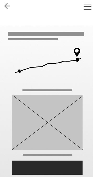
05 - Tracking Screen
REFINING THE DESIGN
Mock-ups
After usability study, it became clear that the users wanted a shorter and simple checkout process. This influenced me to redesign the flow, removing a page in the process. I then edited the checkout page by adding more labels.
Style Guide
Branding; Visual Style and UI Components
Hi-fi Prototype
You can go ahead and open the hi-fi prototype link below.
Blackbeard's Hi-Fi Prototype Link
4. GOING FORWARD
TAKEAWAYS
▪ This project is by no means over as it will require constant iterations to cater for new research findings that will influence the information architecture and scaling of the app and its database.
▪ Among other things, I realized that research is a powerful process that, if done thoroughly, can result in a viable product that will be useful and impactful to its users and the business.
NEXT STEPS
▪ Firstly, I will conduct another round of usability testing to iterate on the visual design and refine it one more time.
▪ Secondly, I will review and edit the sticker sheet, to maintain a current record of the visual styles and guidelines of the app for scalability and consistency purposes.
____________________________________________________________________
Thanks for viewing!
⁕ ⁕ ⁕